eSpark
Design System & Component Library
- Product Designer • Frontend Engineer |
- Figma • Storybook • Svelte • JS • Bootstrap 5
As a fast-growing EdTech company, we had reached a point where scaling our digital product was becoming increasingly complex. The product team, comprised of designers and developers, found ourselves facing inefficiencies due to inconsistent UI elements, lack of design cohesion, and redundant coding practices. As a result, user experience was becoming fragmented across the platform. To address these issues and streamline the workflow, we needed a unified Design System and Component Library to ensure consistency, efficiency, and scalability.
Project Goals
- Consistency Across Platforms
Unify the visual language and interaction patterns across our marketing site and product.
- Efficiency and Scalability
Enable faster design and development cycles by creating reusable components.
- Improved Collaboration
Foster a stronger connection between design and development teams by creating a shared language and toolkit.
- Enhance User Experience
Improve usability by ensuring consistent interaction patterns and UI elements across the product.
Challenges
- Inconsistent Design
With two designers working on different features, design inconsistencies crept in, resulting in fragmented user experiences.
- Redundant Code
Developers duplicated code for similar UI components, leading to inefficiencies and a higher chance of bugs.
- Scalability
As the company’s product offering grew, maintaining and updating the existing UI became time-consuming and difficult.
- Collaboration Gaps
Designers and developers had no central reference, leading to miscommunication and wasted time during product development.
Now we do research 🧐
Audit of Existing Designs
We started by conducting a comprehensive audit of the existing UI components, styles, and design patterns across all products. This involved documenting every visual element, including buttons, forms, typography, colors, and layout grids.
Stakeholder Interviews
We held interviews with designers, developers, and product managers to identify pain points and needs. We also gathered insights on their workflow challenges and vision for a more efficient process.
Here’s what we did ✅
Design System Creation
- Style Guide
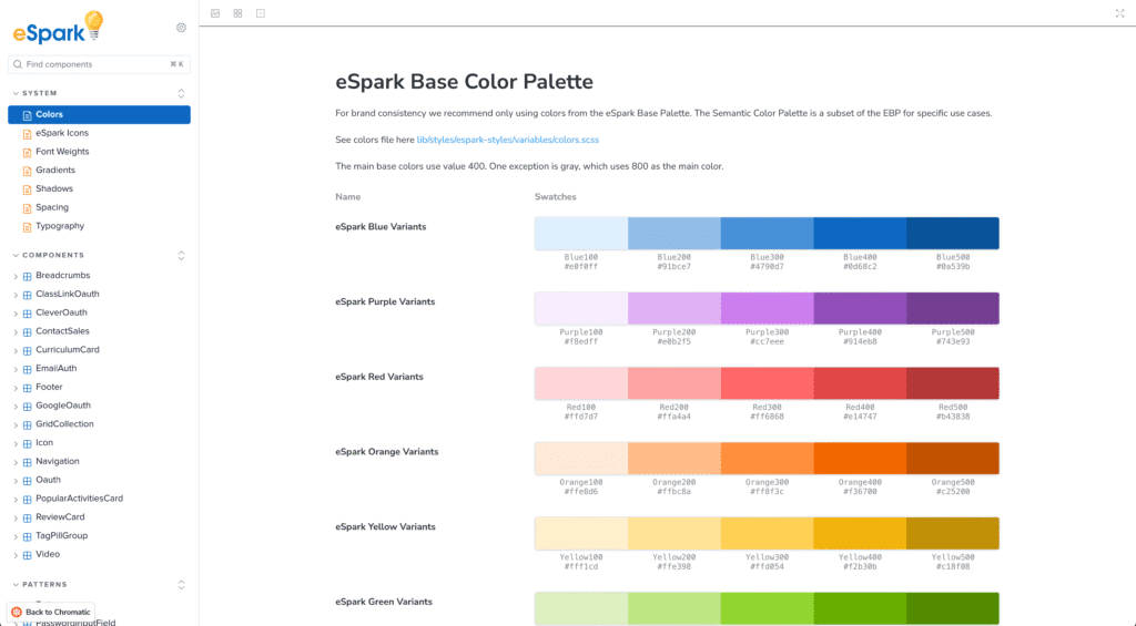
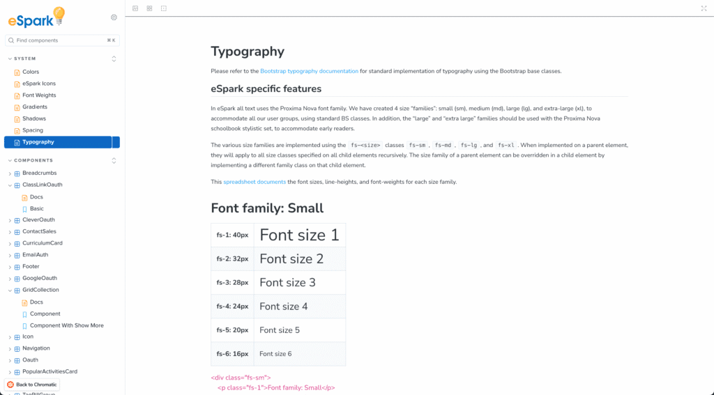
The first step was creating a comprehensive style guide. This included defining brand colors, typography, spacing, shadows, and icons. These elements became the foundation of the design system.
- Component Library
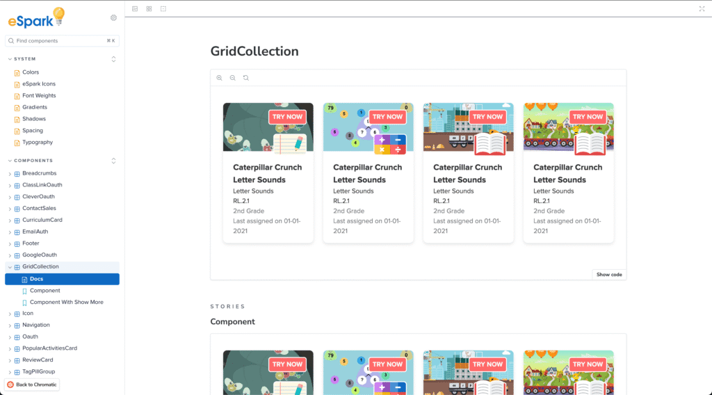
We created a reusable Component Library in Figma and Storybook. Each component (buttons, input fields, cards, etc.) was designed with states (hover, active, disabled) and variants (sizes, colors) to account for different use cases.
- Modular Structure
The design system was built to be modular. Each component could be customized or extended without breaking the core structure, allowing for flexibility while maintaining consistency.
- Documentation
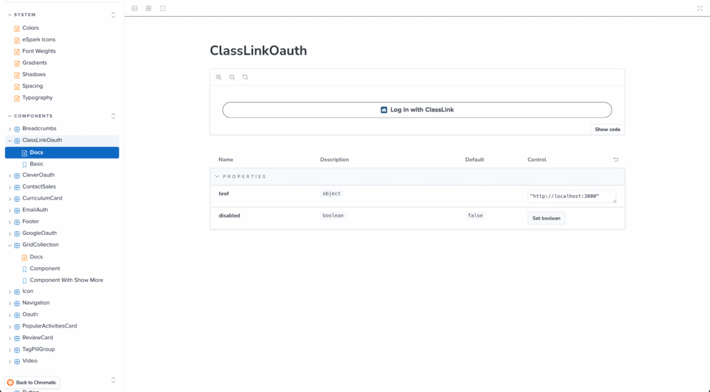
We documented every component and pattern, including guidelines on when and how to use them. This documentation ensured that both designers and developers could quickly reference the same source of truth.


Developer Collaboration
- Integration with WordPress & ACF
I led the proof of concept (POC) for integrating our design system and component library with WordPress, ensuring a unified source of truth for both our web applications and marketing site. Our goal was to enable a self-serve experience for the marketing team by allowing them to ingest and edit components from our Svelte component library, directly within the WordPress dashboard. I implemented a solution that integrated our Svelte components with Advanced Custom Fields (ACF) blocks. This allows the marketing team to seamlessly add components via an ACF eSpark block in Gutenberg and manage content within each component.
- Integration with Storybook
We used Storybook to build out the components in Svelte. This allowed designers and developers to work in parallel, ensuring that the visual design and code were always in sync.
- Tokenization
We established design tokens for colors, spacing, and typography. These tokens were synced with the design system to ensure that any change in the design was easily reflected in code./p>


Results 🎉
Consistency
The design system significantly improved visual and functional consistency across the product. With unified styles and reusable components, users experienced a more cohesive journey throughout the platform.
Efficiency
Designers and developers saved time by reusing pre-built components, reducing redundant work. This accelerated the product development cycle and allowed teams to focus more on innovation rather than reinventing common UI patterns.
Scalability
As new features were added to the platform, the modular design system allowed for seamless scaling. New components could be introduced without disrupting existing ones, and the system remained flexible enough to adapt to future needs.
Improved User Experience
Users benefited from a more consistent, intuitive interface, improving engagement and satisfaction. The integration also streamlined content management for marketing, reducing dependencies on developers and accelerating workflows.